Welcome to the first edition of Behind the Label, our new series highlighting the role that label artwork and design plays in establishing brand voice and creating customer loyalty.
Established in 2011, Spiteful Brewing quickly distinguished itself in the crowded craft beer market, building a brand personality by using hand drawn art as scrappy and defiant as their name implies.
Founded by childhood friends Brad Shaffer and Jason Klein, Spiteful started as a home-brewing operation. By the time they were brewing commercially, they took the same DIY approach to the art on their labels. Reaching out to artists in their social circle led to the creation of labels that captured the contrarian spirit of beer releases such as “Can’t Someone Else Do It,” “God Damn Pigeon Porter,” and “Selfies Are For Wieners.” This led to the eventual hiring of Lucas Snobeck as their first employee to spearhead label art. Most of the early Spiteful cans were illustrated by Snobeck.
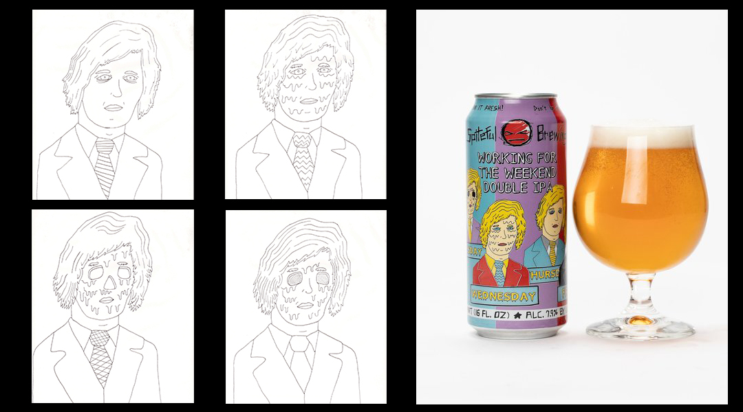
“Working for the Weekend” – art by Lucas Snobeck
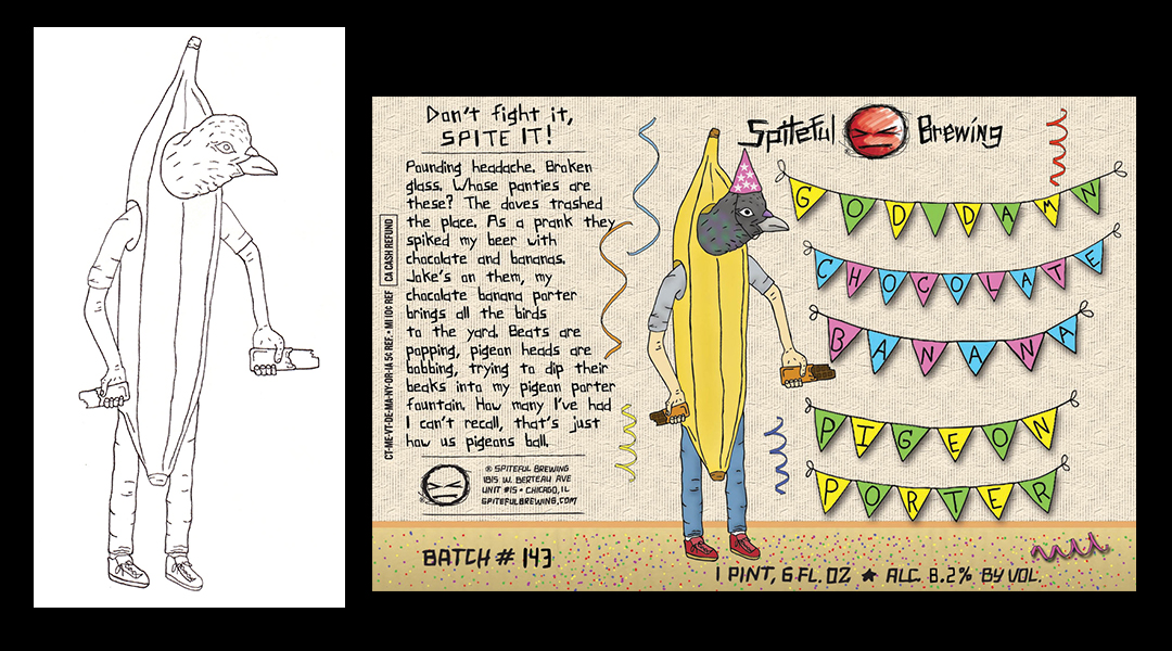
“Goddamn Chocolate Banana Pigeon Porter” – art by Lucas Snobeck
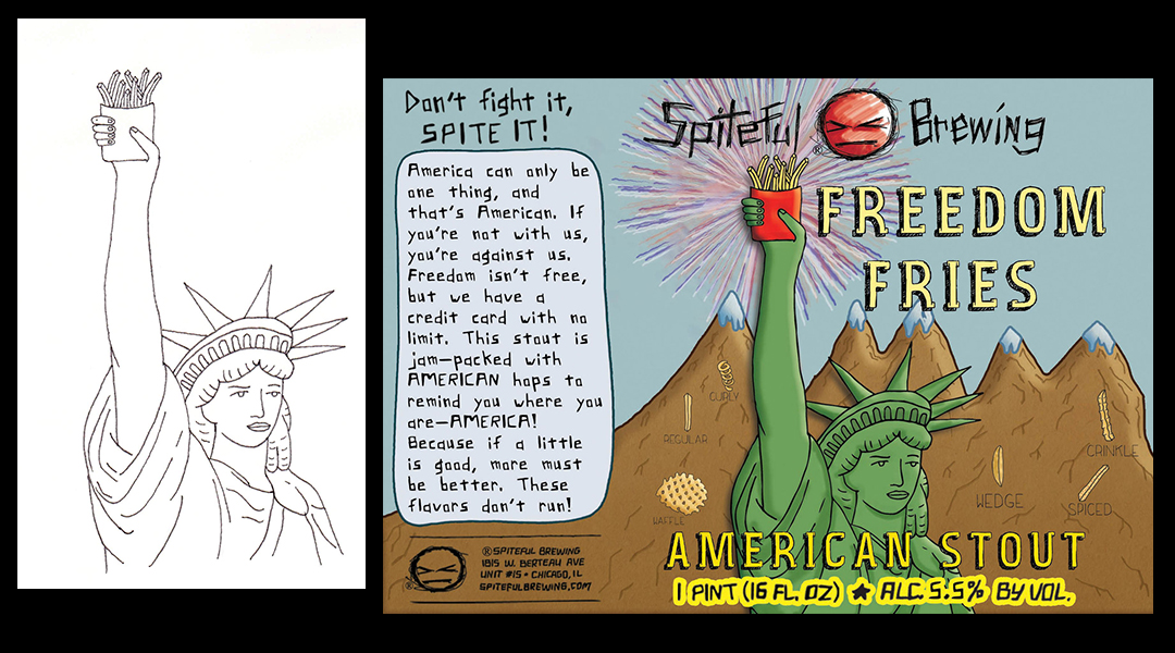
“Freedom Fries” – art by Lucas Snobeck
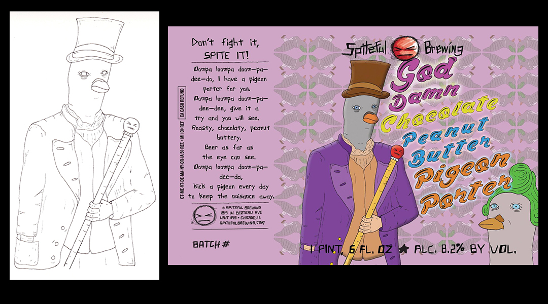
“Goddamn Chocolate Peanut Butter Pigeon Porter” – art by Lucas Snobeck
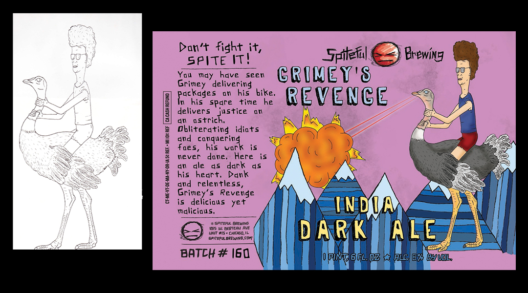
“Grimey’s Revenge” – art by Lucas Snobeck

“Goddamn Coconut Pigeon Porter” – art by Lucas Snobeck
Previous
Next
Klein points to the creation of Spiteful’s instantly recognizable mascot, an infuriated, hand-sketched face resembling an emoji that has lost its patience for life’s nonsense, as a key moment in establishing Spiteful’s brand voice.
“We were home brewing, and we already had the name picked out,” Klein said. “An artist friend of ours, before we even started doing our labels, just started doodling and came about it organically.”
Having their iconic logo viewable at all angles is a top priority for Spiteful to maintain visibility in an Instagram-obsessed craft beer scene.
“We’ve had to battle against the feedback from our artists that there’s too much branding on our cans,” Klein said. “But we can’t control how these are faced on the shelf. If people are posting images with our beer and the logo isn’t featured, that does us no good.
“Whether people love or hate the logo, they remember it.”
Klein also stresses the importance of label art in establishing a visual identity in a congested craft market. “Today, the labels are much more important than when we started,” he said. “You could get away with just being local. Put ‘local’ on the label and basically people would buy it, even if it wasn't very good. Now you have to be local and very good.
“I think a lot of microbreweries and microdistilleries don't appreciate that—the value of the visual,” he said. “Not because they don't care, but because they're small and it's like, ‘That's not for us, that's for big companies.’ But in reality, it's important for any business, especially if you're going to get on the shelf next to those bigger competitors. We're on the shelf next to some pretty big mainstream and craft brands.”
Klein added, “That's why for us, from day one, the branding was very important. Even subtleties like the red tab sets us apart. I think that it's very much a part of who the brewery or the distillery is. Many times, it's the only way you have to communicate any message until that purchase is made. Obviously, you can get the word out through social media, but when someone's looking at the shelf, this is all they have to go on.
“If you're not interesting, or you look like everybody else, I don't know how you stand out.”