What's Next April 2015 - Change It Up
Mar. 30, 2015

Product innovations and new packaging design play important roles in the beverage industry. We compiled insights from experts in the marketing and beverage industries to further explore how these changes can be captured to grow your business. We spoke with Dave Palmer, LOVE Executive Creative Director, (the creator of Haig Club) and Svend Jansen, PR Director Southern Comfort, as well as taking an in depth look at the current new packaging launch from the Bacardi family of brands.
Key Insights from the Experts
- Customers, especially Millennial-age consumers, are seeking innovations and new products. This desire keeps them coming to your business time after time and by having the latest version of a bottle or by featuring a brand extension or Limited Edition on a popular brand you can maintain credibility with your customers.
- New packaging is a brand’s opportunity to improve upon the design and final product, modernizing their production process as well as making the product more desirable for the retailer, bartender and end consumer. New modern products and materials give retailers and bartenders the opportunity to be creative with displaying these products, allowing them to continue to stay at the forefront of their business.
- When a brand updates its packaging a conversation is maintained with the consumer, keeping them engaged in the evolution and story of the product.
For more detailed responses from the experts read on.
Dave Palmer, LOVE Executive Creative Director
What was the inspiration behind the Haig Club bottle? How was the bottle designed?
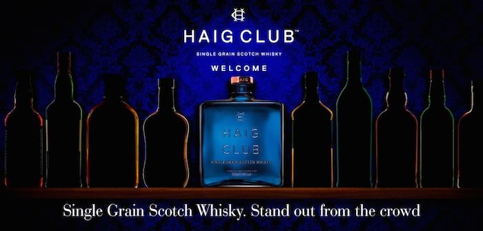
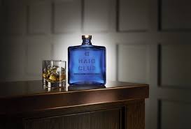 Inspired by the category’s long lost connection to cool, LOVE created Haig Club, a new single grain Scotch whisky. In a category that always defaults to old school design conventions, full of drab browns, greens and greys, Haig Club was designed to be different. Its square profile stands out on the shelf in a brilliant cobalt blue. The hue is an echo of the nosing glasses that master blenders use to craft whisky. As such, the blue is a design cue that speaks to tradition, but realized in a very contemporary way. The House of Haig are the world’s oldest Scotch whisky distillers, and so the agency wanted to pay homage to this heritage, but not be burdened by it. The embossed branding is inspired by antique Victorian glassware. Similarly, the square profile comes from design codes of the couture fashion industry. The confident, sleek and minimal double fronted pack playfully features the image of the bottle, giving retailers the opportunity to present the pack in interesting ways.
What factors do you consider when considering bottle design/packaging?
When we think about design icons, we're talking about that impossible to put your finger on combination of shapes, elements and cultural context that imprint themselves on our collective consciousness. For a bottle that means shape, form, color and crucially the cultural landscape which it sits.
How do you know when it is time to change/update bottle design for a brand like Haig Club, Johnnie Walker, or Tanqueray?
Once a brand becomes iconic, beyond form, color and shape, then an overhaul of the design isn't necessary. However, it's still important for brands to stay current and in tune with culture; that remit can be fulfilled by limited editions which allow brands to retain the true values of their design, but at the same time react quickly and gain exposure within a wider cultural context.
Svend Jansen, PR Director Southern Comfort
Why is it important to update packaging on well-known brands?
 We recognize the power of packaging and the impact it can have on our business. Southern Comfort has 140 years of history behind it, so one of the challenges is weighing that equity against the opportunity to start a new conversation with drinkers.
What do you consider when updating packaging?
The new packaging feels like Southern Comfort - confident and comfortable with itself. It moves past old south imagery in favor of clear communication and looks great on the shelf. We crafted an entirely new bottle, but we championed the fluted shoulders that have been part of the brand since some of its earliest forms. No one else has those as a signature. Overall the form is more sturdy and masculine, and less delicate than previous expressions of the brand.
Why did you change the Southern Comfort label and bottle?
The packaging change to the bottle shape and label were made to illustrate its unique position in the whiskey category. Our latest packaging has been validated by consumers — new, existing and young Legal Drinking Age. Also, the new packaging was developed to last; both timeless and future-proof, remaining reverent to our past and to today’s market.
Has the bottle been changed before?
Southern Comfort has been around since 1874, so it’s seen many changes to modernize through the times. This package change is a refinement of the Southern Comfort bottle. The label still uses our warm colors, the bottle is still round with our iconic grips and MW Heron’s (the brand’s creator) signature still remains.
Who designed the new package?
Christian Helms and the award-winning creative team at the Austin-based Helms Workshop.