Deschutes Brewery Unveils New Packaging Designs
Aug. 17, 2015
Deschutes Brewery has unveiled the brand's new look just days ahead of the Street Pub's stop in Chicago. Deschutes' entire line-up of bottles, cartons and tap handles will feature refreshed packaging which has been designed to better reflect the quality of the beer inside, as well as increase shelf presence.
Jeff Billingsley, director of marketing for Deschutes, said, "As the craft beer segment continues to grow, and we continue to expand, it’s critical that we stand out on the shelf and reinforce our brand. We’ve incorporated many key elements in the new design that should help us achieve this goal. We are excited to hear what our fans think about the new look!"
Deschutes' decision to undergo a complete design revamp was in part done to improve brand awareness and ensure the packaged products stand out among increasingly crowded shelves and tap handles.
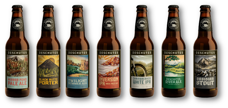
From Black Butte and River Ale to Pine Drops and Fresh Squeeze each Deschutes brand has its own unique color palette and typeface, with company branding in black for the mainline and seasonal brands, and red for the Bond Street Series. The updated illustrations associated with each brand have been retained in the new design to further highlight each beer’s individuality. Even Deschutes' own logo has taken on a more modern, bold-stamp look which now stands out on the bottle-neck of each brand.
The newly designed packaging will roll out into Chicago starting this month, so take advantage of this redesign and display these beers prominently.